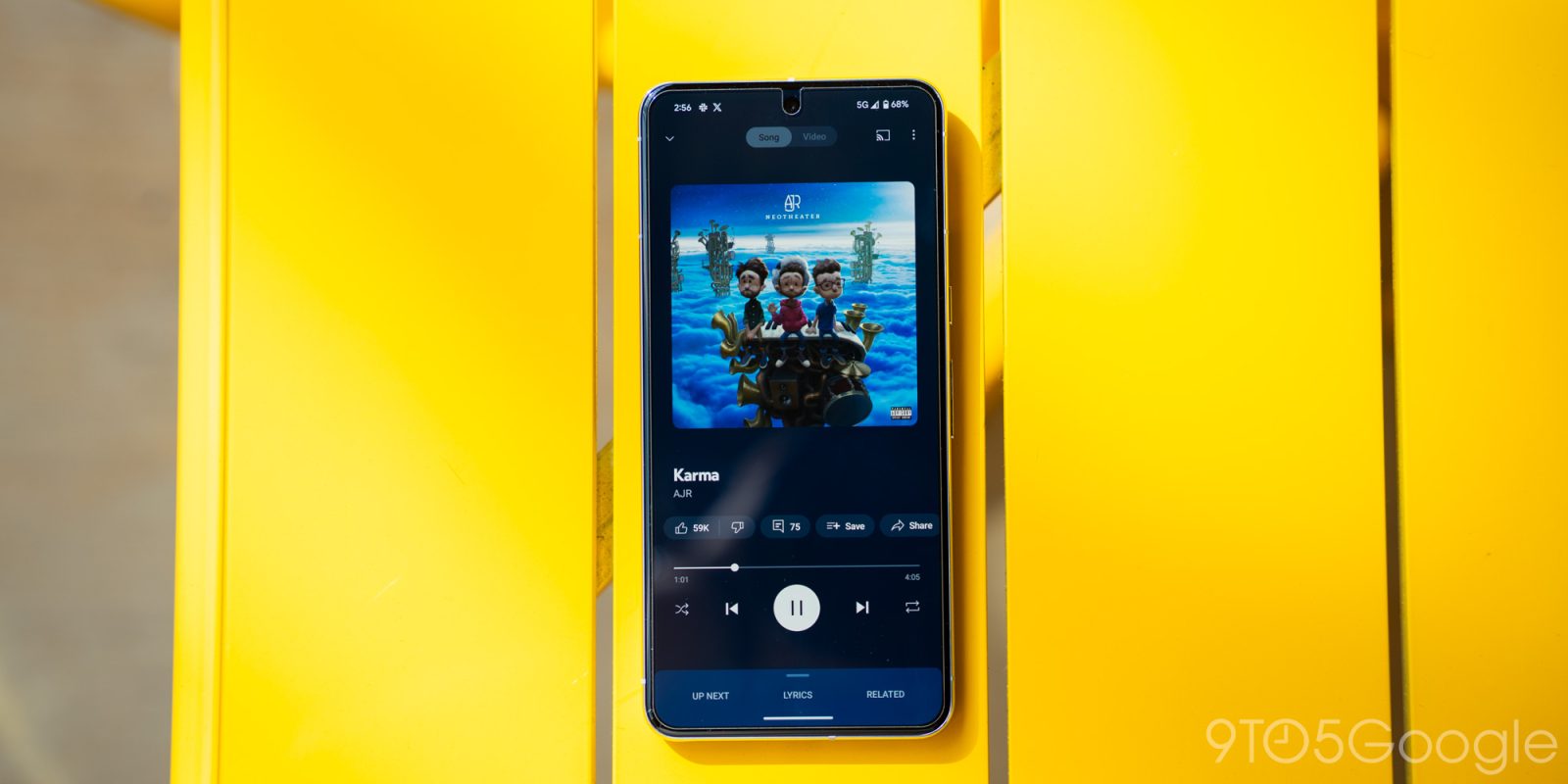
In addition to a revamped overflow menu, YouTube Music is testing a redesign of the Cast UI on Android that makes use of a bottom sheet.
Instead of the “Cast to a device” box, you get a sheet with rounded corners that first lists “Suggested” targets and then “Other devices.” It’s much more compact and looks like video player settings from the main YouTube app, while YTM for iOS already uses a similar approach.
When you’re Casting, you get a minimal “Playing on” sheet with just a volume slider instead of replicating the artwork (because you can now see most of the player), while play/pause has been removed.


L-R: iOS, Android (current), Android (upcoming) via u/notjhoan
It’s a nice modernization that follows how YouTube Music moved the Cast button to the permanent miniplayer last year. It’s part of Google’s push for a “Persistent Cast icon” so that “users will see the Cast icon whenever they need and can receive better help and guidance on why they don’t see a specific device.” This was detailed in January alongside the upcoming Tap to Cast feature for a docked Pixel Tablet and Google phones with UWB (Ultra-Wideband).
This Cast sheet redesign in YouTube Music for Android is still in testing and not widely rolled out yet. The overflow menu revamp is also not fully launched.


Old vs. new
More on YouTube Music:
- YouTube Music sending out more notifications, adds ‘Samples’ carousel
- YouTube Premium reaches 100 million subscribers
- YouTube Music is missing too many podcast basics
FTC: We use income earning auto affiliate links. More.

Comments