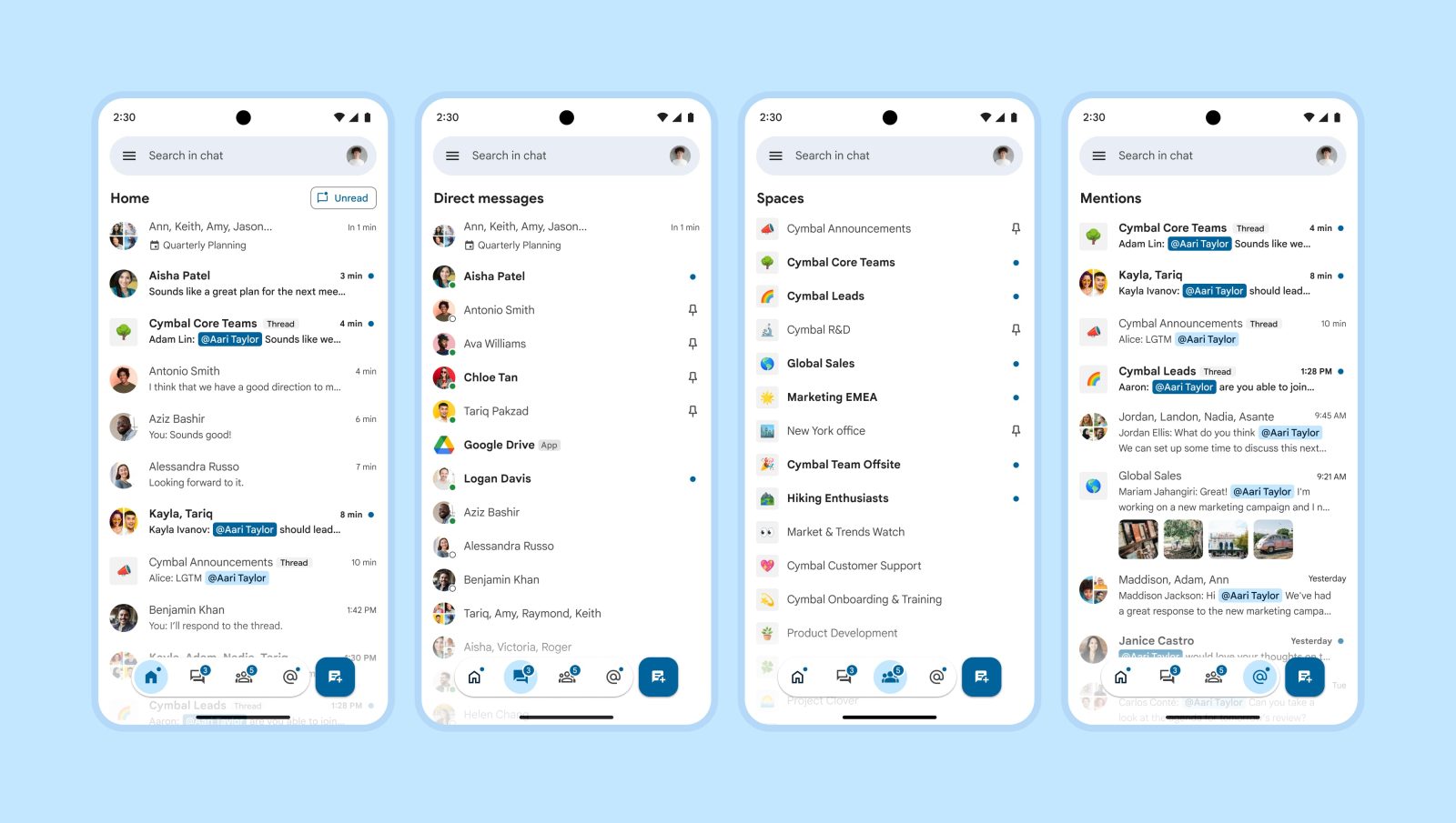
Back in August, Google announced a big redesign of Chat that adds Duet AI and other smart features, as well as audio huddles, to the work-focused messaging service. A new homescreen is core to this revamp, with the straightforward web version announced first. Last week, the redesigned mobile client was introduced with a new take on navigation for Google apps.
9to5Google has a rebooted newsletter that highlights the biggest Google stories with added commentary and other tidbits. Sign up to get it early in your inbox, or continue reading 9to5Google Log Out below:
Instead of a bar docked to the bottom of the screen, you get a pill-shaped container with four sections and a circular tab indicator, while there is a separate square button to the right. The different shapes are a bit jarring, with the floating action button (FAB) being taller than the pill for whatever reason. I’m also not a fan of both things being centered and would prefer the bottom bar being left-aligned while the FAB is positioned normally.
This design inherently does not support text labels under each tab. Thankfully, the Google Chat icons are pretty straightforward and representative of Home, Direct messages, Spaces, and Mentions. This, however, might not be the case for all services.
This new bottom bar floats and applies a translucency effect to content above/below and to the left/right. I assume the intention is to let users get a peek at what’s being covered by the bar, but it’s not a lot. At best, you get to see a profile picture and timestamp. I’d rather the new bottom bar take up more horizontal space.
More broadly, it’s weird to have the create/compose button on the same level – in terms of organizational hierarchy – as the core sections of the app. In the case of Google Chat, starting a new conversation is an action that can be shared across all views. However, I don’t think that’s applicable to other applications, with the FAB’s function usually being highly specific to the particular tab.
Meanwhile, in Gmail, this new bottom bar appears above the existing one docked to the bottom of the screen when you open the Chat tab. The floating nature of the new navigation element is what makes this design possible, but it results in a very cluttered look.
What’s notable about this revamp is that we know the other design that Google contemplated. In May, Google shared a “Timeline” redesign of the Chat that’s a bit more conventional. Top tabs would have avoided the double bottom bar look we have today in the integrated Gmail experience.
At the end of the day, this new bottom bar still looks like one, and users should not have any issues navigating Google Chat. However, the big question is how it fits into Material You, which – for better or worse – is associated with large touch targets and spacious layouts.
The new bottom bar feels much more compact than Material 3, which might be Google’s way of course-correcting with an eye toward density. In all, I wouldn’t call this Material 4 by any means, but a theoretical Material 3.5 feels right.
From 9to5Google
Hands-on: Beeper Mini might be even better than an actual iMessage app for Android
Google app readies new Sports widget for your Android homescreen [Gallery]
Amid busy holiday travels, Apple still holds back Android’s ‘Find My Device’ network
Pixel Watch 2 gets first Google discount as Black Friday 8 Pro deals & trade-ins return
Google Wallet notifications will be sent directly from the app [U]
Nothing had another worrying security problem in its CMF Watch app; now there’s a way to report it
What (else) is happening
Pixel Camera 9.2 rolling out: UI redesign & Ultra HDR on old phones, more
Instagram and Facebook Messenger chats are being disconnected this month
Google Messages starts rolling out Photomoji [Gallery]
OnePlus 12 goes official with 24GB RAM, 4,500 nit display, higher price
Discord launches redesigned app on Android and iOS
From the rest of 9to5
9to5Mac: Halide camera makers are working on a video capture app next
Electrek: Tesla Cybertruck Range Extender option is just the beginning…
FTC: We use income earning auto affiliate links. More.


Comments