Over the past couple of weeks, Google Maps has widely rolled out a new color palette across its various apps, and the reactions have so far been mixed. So, now that everyone has it, what do you think of the new colors in Google Maps?
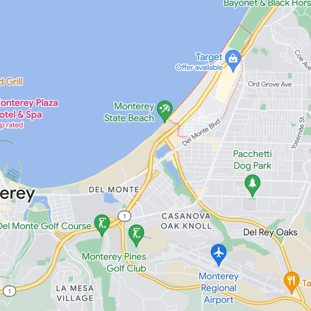
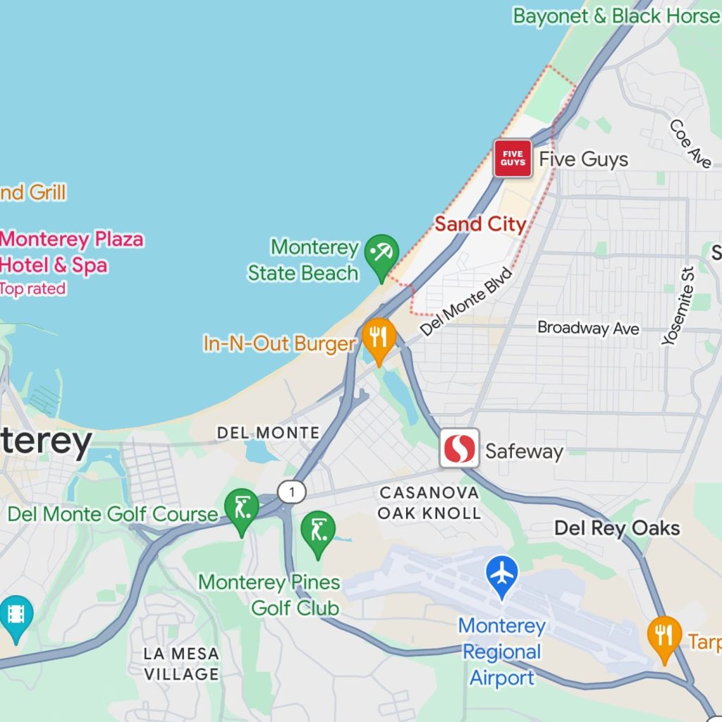
Google Maps has, for years, had the same warm color palette. Roads were yellow, parks/forests were green, and water was a vibrant, warmer shade of blue. But, now, everything has changed. Green has become a bright mint color. Blue has gone for a muted, cold shade of the color. And, beyond that, roads are always now grey.
It’s a polarizing change, and one that you’ll seemingly either love or hate.
- Google Maps rolls out new colors on Android, iOS, and web
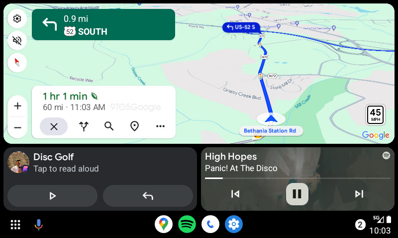
- Google Maps for Android Auto gets updated colors too
From my own use, I think there’s a lot of good, and a lot of bad.
On the good side, I think parks and forests in green are much more clearly visible on the map. The new colors as a whole also feel better separated from the badges used for restaurants, stores, and other locations with pins. The grey color for roads also makes road names much more easily readable.
Top comment by Billiam Belliam
The colors themselves aren't awful, I'm sure I will get used to them. However, they were implemented very poorly and I have a laundry list of complaints.
The road colors are dreadful. At many zoom levels you cannot tell the difference between controlled-access highways and regular roads.
Railroads are now the same color as roads, making it hard to find where rail lines are.
In addition they got rid of being able to see campus boundaries which I feel was a completely unnecessary change that only makes using the map harder.
Terrain/topographic mode is now practically unusable because the road colors are too dull to be able to pick out from the terrain.
They did not change the colors of buildings/businesses to match well with the new terrain colors, making them clash in very bad ways in many many situations.
Alternate route colors are just a lighter shade of the same color now, which makes it hard to tell the difference between alternate routes and your current selected route in many lighting situations
All of these may seem petty but they add up, and when the main functionality of a map is to quickly be able to pick out information, this redesign is a failure as practically every change makes it harder to pick out information.
But, on the other hand, everything just feels cold and uninviting in terms of colors. That’s largely up to personal preference, but there are actual downsides too. For instance, the new gray color for roads actively goes against the design language Google has instilled for years. While driving, the former color palette would show alternate routes in a gray color to differentiate from the yellow. Now, alternate routes are in a translucent blue that barely splits the difference between the default gray and the blue of your active route.
It’s confusing to look at, and even worse at night!
And it’s not just me either. Elizabeth Laraki, one of the former Googlers that helped design Maps, took to Twitter/X to talk about problems with the new colors, but even more so about the more-and-more cluttered design of modern Maps.
With all of that said, what do you think about the new Google Maps color palette? Do you think it’s an improvement? Is it worse? Are you getting used to it? Let’s discuss in the comments below.
More on Google Maps:
- Google Maps will let you filter transit directions and vote in lists
- Android Auto is rolling out another new design for Google Maps
- Google Maps rolling out Immersive View for routes, more detailed navigation, EV updates
FTC: We use income earning auto affiliate links. More.

Comments