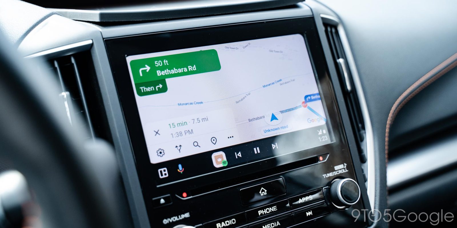
New tweaks to the UI design of Android Auto come pretty frequently, with Google Maps now getting another facelift to the navigation screen.
Rolling out now on Android Auto, the navigation section of Maps is getting a facelift with new button designs and less crowded information.
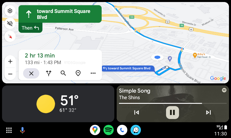
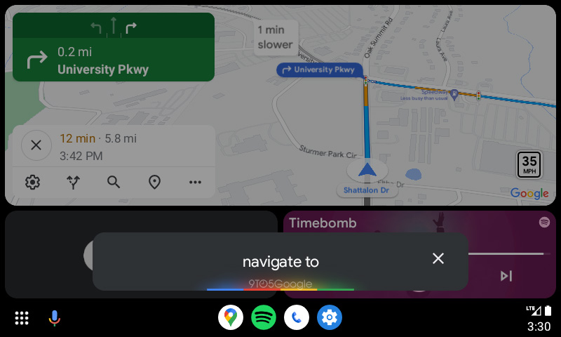
The update, which appears to be server-side and may not be showing for all users just yet, has the estimated travel time listed at the top in bold text, with distance and estimated time of arrival (ETA) below that. Further down, button to stop navigation, look at alternate routes, search for additional locations, see stops on the route, and an overflow button are shown. These have also been slightly redesigned, and removed a line divider between the two sections that appeared in the previous design.
The new look is much more modern, and plays especially nicely with the new sidebar that Google launched on Android Auto recently.
We’re seeing the change on Google Maps v11.104.0100 and Android Auto v10.8, which are rolling out via the Play Store.
More on Android Auto:
- Android Auto may soon be able to use your phone’s wallpaper as version 10.7 rolls out
- AAWireless adapter for wireless Android Auto gets another price cut in US, UK, and Europe
- Android Auto gets new app for finding EV charging stations with Google Maps & Waze integration
FTC: We use income earning auto affiliate links. More.


Comments