Especially after the last round of updates, YouTube decidedly does not feel like a first-party Google app.
9to5Google has a rebooted newsletter that highlights the biggest Google stories with added commentary and other tidbits. Sign up to get it early in your inbox, or continue reading 9to5Google Log Out below:
While there is an animated splash screen (like the Workspace apps), it takes a second too long to complete, and I always feel like I’m waiting for it. In comparison, other implementations are done in a blink of an eye and – if anything – I’m more likely to miss it.
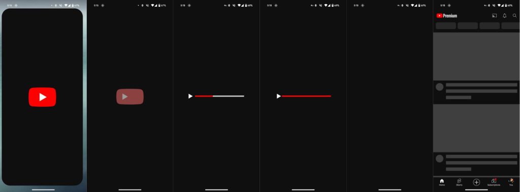
Once in the app, there’s a short bottom bar that, at this point, looks out of place compared to the taller Material 3 style that leverages pill-shaped indicators to note the current selection. That said, one point in defense of the minimal height is the miniplayer. As media apps, YouTube, YT Music, and YT TV have to display playback controls just above the persistent navigation element. A tall bottom bar with another row of buttons above it would just cut into the viewing space for content.
Speaking of buttons, YouTube maintains its own iconography that uses thin lines and is something I more associate with the iOS 7-era design language than Google’s. The icon set is straightforward enough, but it’s overly minimal and doesn’t fit in with Android or Google, which uses bolder outlines.
With the recent changes, YouTube introduced a “You” tab that combines the Library and account menu. Your profile picture appears next to the other bottom bar icons. It looks unbalanced and makes YouTube feel more like a social app. Of course, YouTube is a social network, but I’d argue that more people use this particular client for content consumption than creation.
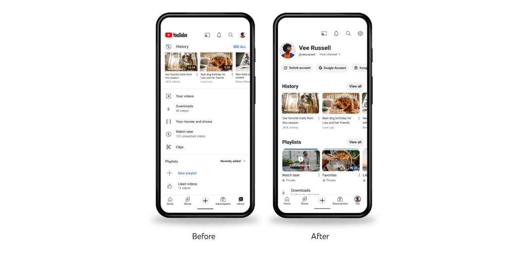
As part of this change, your profile avatar no longer appears in the top-right corner. This is a big departure from how every other Google app conceptually works. Instead, the account switcher appears in the You tab, which is also where you have to go to access settings.
A secondary effect sees the search icon move to the very right position, and this has been extremely disruptive to muscle memory. I keep opening the notifications feed because I’ve trained myself to avoid the account menu in the corner when I just want to look things up.
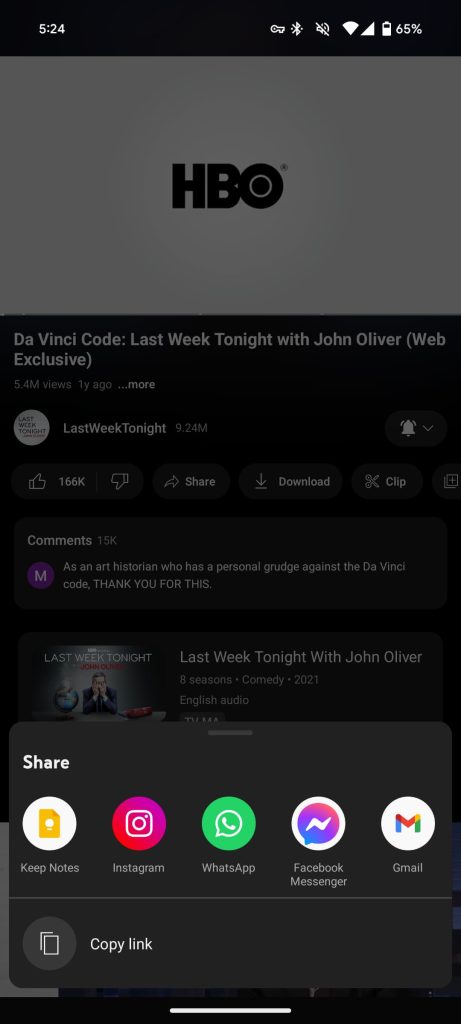
Another inconsistency is the non-system share sheet across YouTube and YTM. Chrome and Google Photos switched with Android 14, and I hope YouTube will follow because its own approach doesn’t really add any value.
Finally, there’s the lack of Dynamic Color. Even as an always-on dark theme user, I’ve grown to expect some level of tinting in my apps as part of device personalization and cohesiveness. The YouTube apps just seem inconsistent even as I don’t mind AMOLED black. (Meanwhile, some people really want a light theme for YouTube Music.)
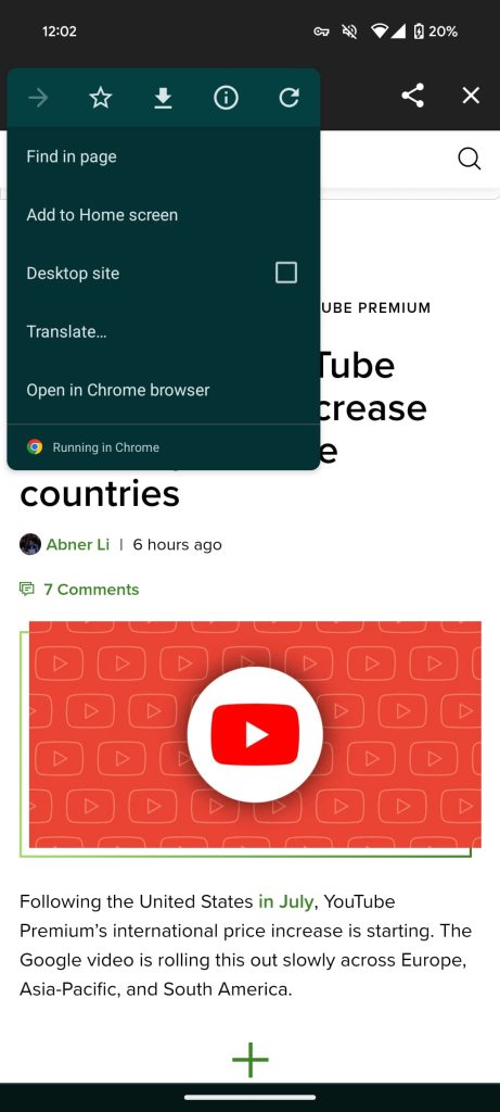
(Dishonorable mention: YouTube’s Chrome Custom Tab flips the close and overflow menu buttons. Inconsistency nightmare.)
This more independent, platform-agnostic design language does help YouTube maintain its apps on Android, iOS, and the web. However, I’d argue the clients are beginning to diverge too much from common practices that do have their benefits.
From 9to5Google
Gboard for Android getting a ‘Scan Text’ OCR tool [Gallery]
Google Chat gets message bubble redesign, looks like Google Messages
Messages for web starts rolling out new Google Account device pairing
Review: Peak Design’s Google Pixel 8 cases are even better in color
Review: Thinborne’s Pixel 8 and 8 Pro aramid fiber cases are the cleanest you can probably find
Samsung removes Galaxy S20, Note 20, more from list of devices getting Android 14
What would you pay to block YouTube ads? [Poll]
Apple Watch support for Android was ‘nearly complete,’ canceled to protect iPhone
What (else) is happening
Pixel owners with Android 14 storage issue can sign up for test OTA update
Android 14 QPR1 Beta 2.2 rolling out with 34 Pixel bug fixes
OnePlus Open’s excellent ‘Open Canvas’ multitasking is coming to OnePlus Pad
Apple called Android a ‘massive tracking device’ before doubling down on privacy
Report: Qualcomm confirms the Galaxy S24 will go back to partially using Exynos chips
Google Keep is replacing Assistant Notes and ‘Shopping List’
Top comment by AintaDamnThingFunny
"Some people really want a light theme for Youtube Music" That's me, please and thank you.
Google Meet now lets enterprise users make direct calls without sending a link
Google Play opens 2023 voting for best new Android app and game
From the rest of 9to5
9to5Mac: M3 Mac benchmark results reveal whether performance lives up to Apple’s claims
Electrek: Watch Tesla testing Cybertruck’s 4-wheel steering as if it’s sliding on ice
FTC: We use income earning auto affiliate links. More.
Comments