At Cloud Next ’23 in August, a big enterprise-focused revamp of Google Chat with a new homescreen, Duet AI, and audio-first huddles was previewed. A smaller redesign of Google Chat today adds message bubbles for a more modern look.
Instead of messages appearing as lines of text directly against the Dynamic Color background, Google now places chats in bubbles. What you send is placed in a themed rectangular container with rounded corners, while the bubble is more stylized (sharper) and gray for the other person.
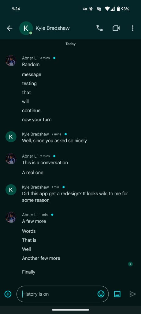
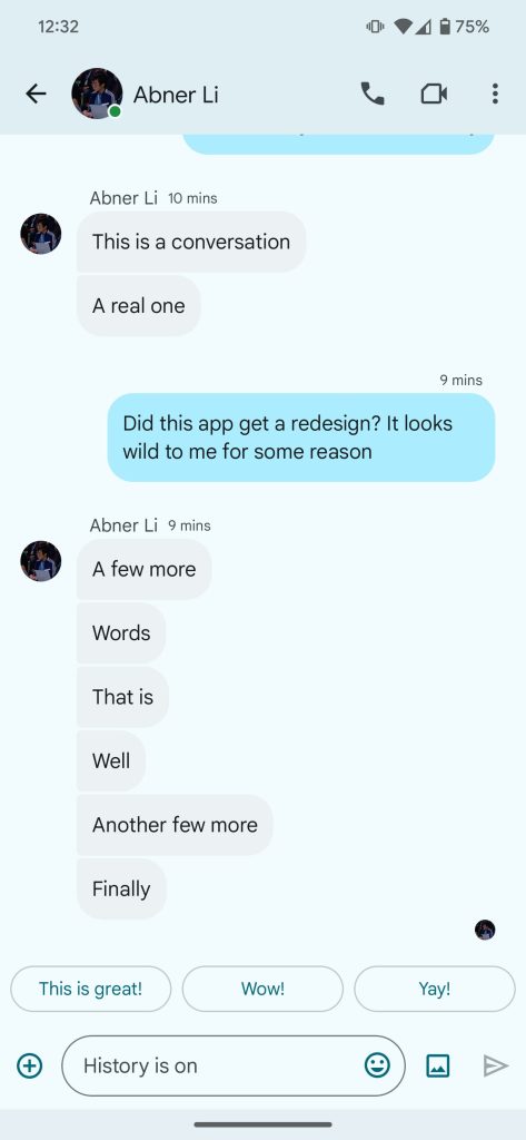
What you type appears at the right, while everything else is left aligned. This also applies to Spaces and helps distinguish threads. Previously, there was no difference and your replies looked like all other conversations.
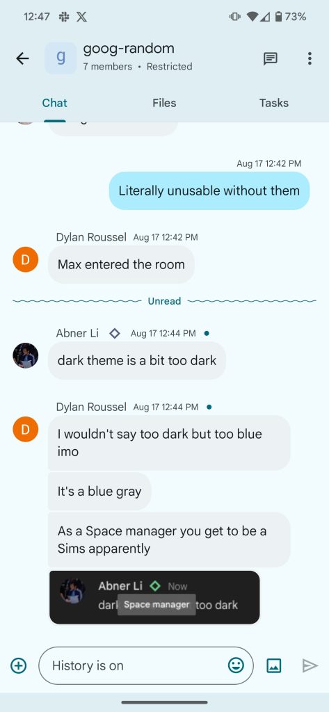
Google Chat also makes use of a squiggly line for “Unread,” which Google Messages just started rolling out.
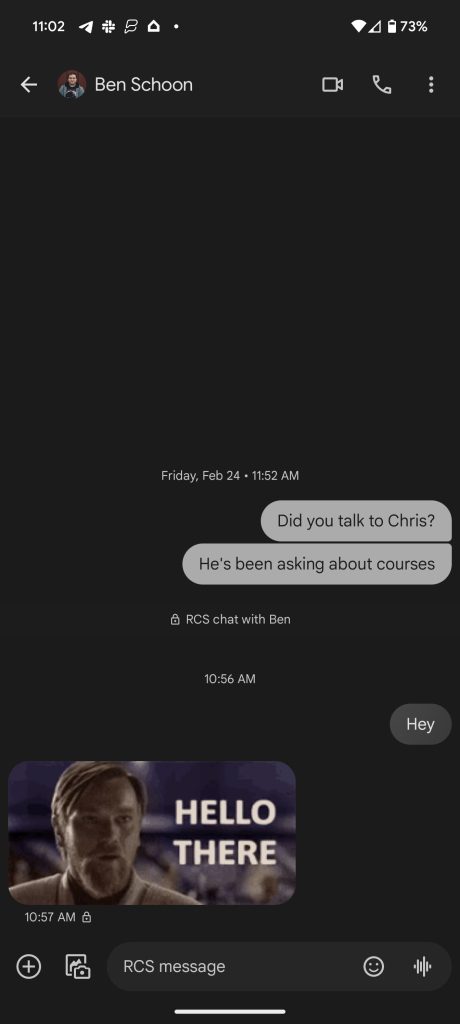
Speaking of Google’s SMS/RCS app, this conversation screen now looks a lot like Google Messages from the contact profile picture and name in the app bar to the shortcuts for audio and video Meet calls — though in different positions — as well as the overflow menu.
These message bubbles for Google Chat are not widely rolled out on Android devices we checked, but it’s live on chat.google.com and the web Gmail instance.
More on Google Chat:
- Yes, search bars in Gmail and other Google apps have gotten bigger
- Google Chat adding voice messages and interoperability with Slack, Teams
- Google reminds us that Google Chat can be used with friends and family
- Google Chat’s future might have a new logo and ‘Timeline’ redesign
Thanks, Owen
FTC: We use income earning auto affiliate links. More.
Comments