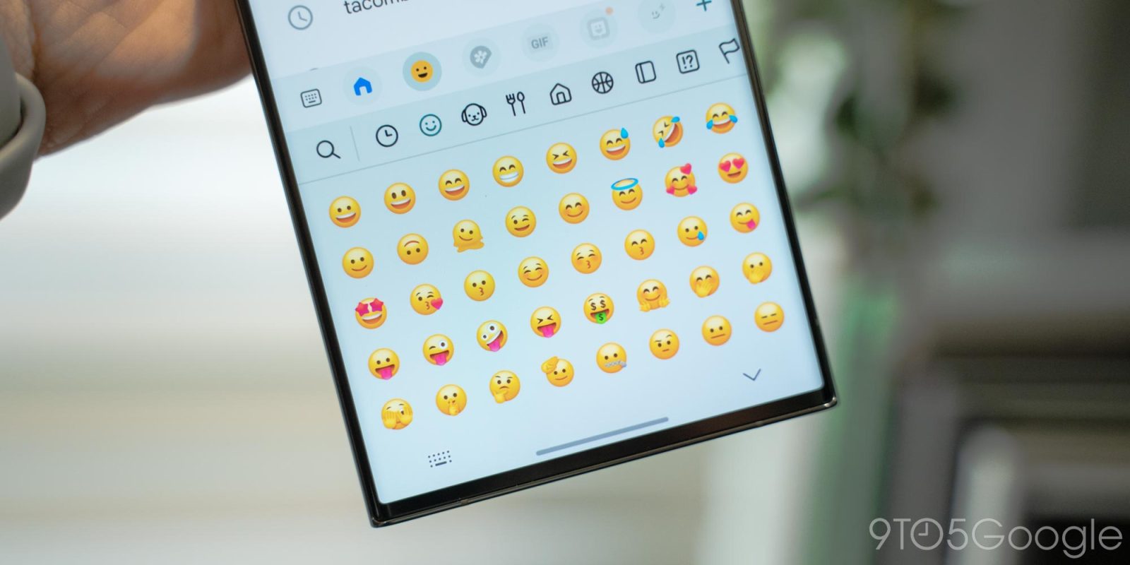
Personally, I’ve never been a fan of Samsung’s emoji design, but the company seems to be trying to improve the look and feel as of late. In One UI 6 Beta 3, Samsung is further refining its emoji.
With its Android 14 update, Samsung launched a new look for its emoji which, traditionally, have clearly taken some inspiration from Apple’s emoji design. The look was updated with a still-3D design, but new colors and nice faces.
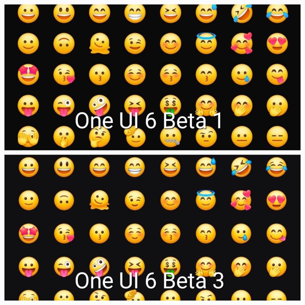
In the latest beta update, Samsung is further evolving its new design with added contours and shadows across almost all of its emoji. The change was highlighted on Twitter/X by CID, and they’re definitely a considerable improvement. The added details and depth still feel a lot like iOS, but they look much better than Samsung’s previous design.
CID posted a direct comparison between One UI 6 beta 1 and beta 3, as seen below.
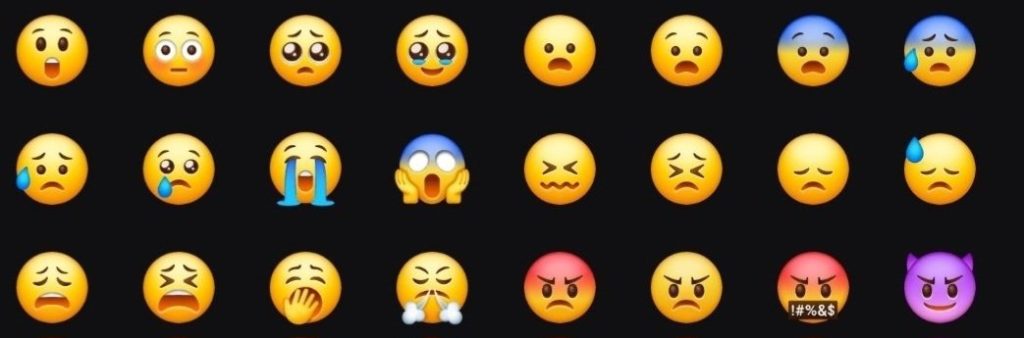
Another screenshot shows a few more designs including scared, angry, and crying emotions.
It’s likely that this design, or some further evolution of it, will stick around through the final release of One UI 6.0. That’s likely to come before the end of the year, but we don’t know the exact timing yet, especially as Google’s own release of Android 14 is still up in the air.
More on Android 14:
- The Android 14 QPR1 Beta is coming next week
- OnePlus launches first Open Beta for OxygenOS 14, its take on Android 14
- Samsung’s Android 14 update makes it much easier to mirror your screen via Chromecast
FTC: We use income earning auto affiliate links. More.

Comments