After first testing a year ago, Chrome for Android is now rolling out a Material You redesign of the address bar.
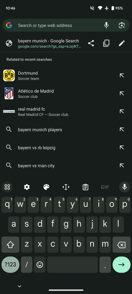
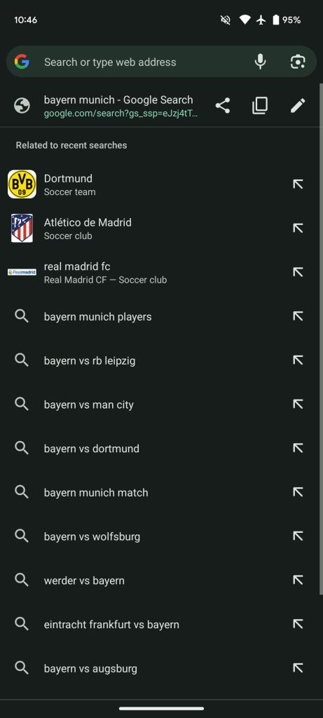
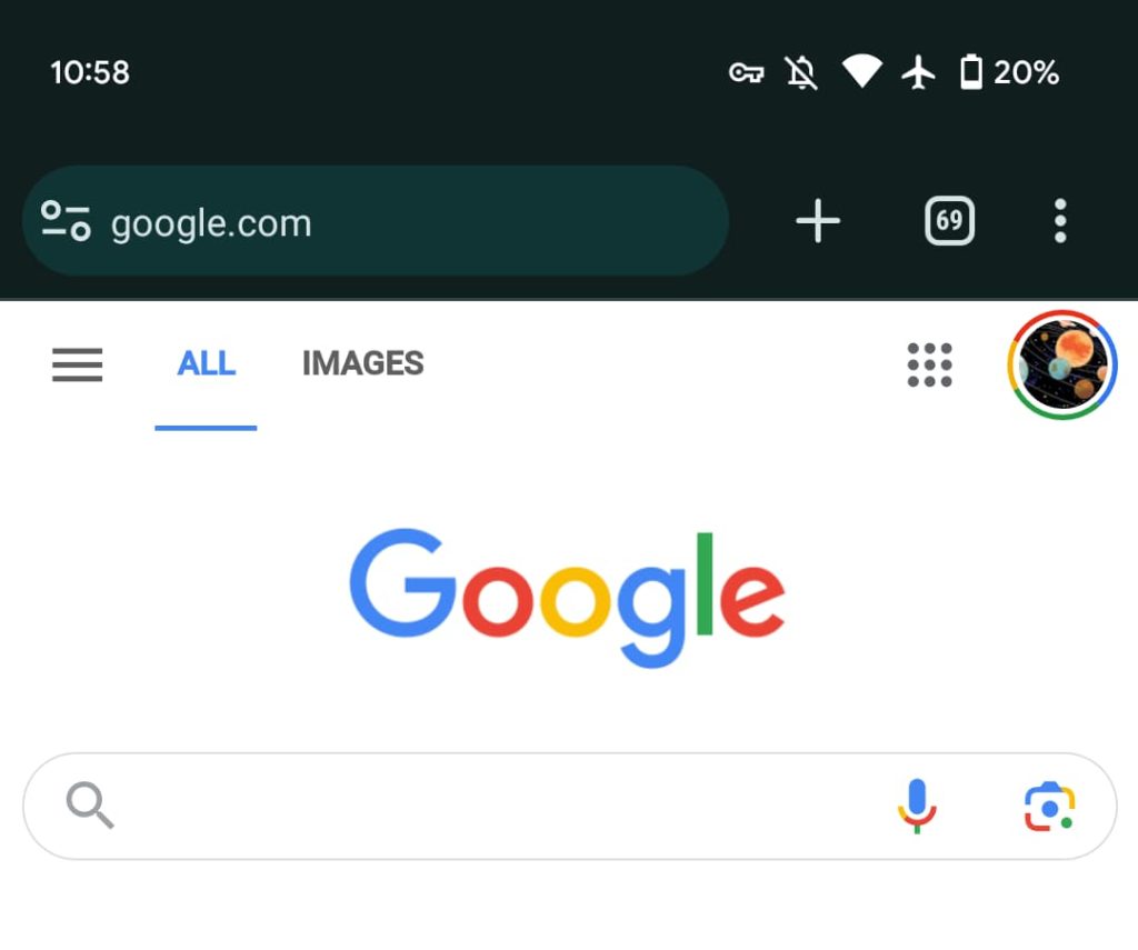
Tapping on the pill-shaped Omnibox will expand and morph the field into a rounded rectangle. The suggestions below will no longer appear as just text against a uniform background. Instead, each site and search query is placed in a card with more padding and Dynamic Color leveraged.
In many ways, the UI now looks like Pixel Launcher search. While Chrome is better conforming to the latest design language, this redesign makes the address bar quite dense and visually complex. Placing everything in a card does help distinguish each line and item, but at the expense of adding more browser chrome, ironically, that is nice but arguably not critical.
Google first tested this address bar revamp last September. We’re seeing a wide server-side rollout (with Chrome 116) this morning. If you don’t have it yet, Force stop Chrome from App info.
Meanwhile, Chrome 117 is still rolling out as the latest stable. The big change there is Material You redesign on Mac, Windows Linux, and ChromeOS, but it also starts to replace the HTTPS lock in the Omnibox with a new switch icon.
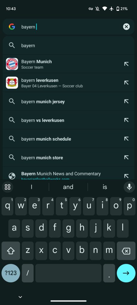
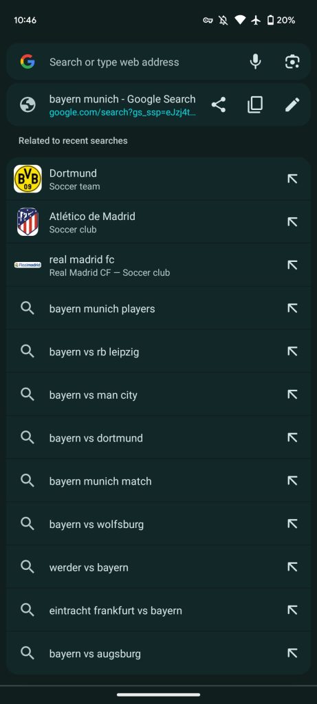
To our eye, it’s placed way too close to the left edge on Android.
More on Chrome:
- Chrome for Mac will soon let you access iCloud Keychain passkeys
- Privacy Sandbox in Chrome hits general availability ahead of 3rd-party cookie deprecation
- Google Pay autofill in Chrome will actually name and show saved cards
FTC: We use income earning auto affiliate links. More.

Comments