Google has quietly made an update to the Play Store on Wear OS, with app listings in search getting much bigger cards that show more information.
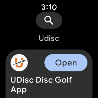
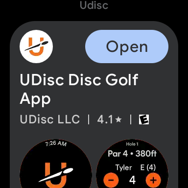
Searching for apps in the Google Play Store on Wear OS is a core function of the store and works rather simply. But, in a new update, Google has started showing apps with large cards in place of the previous scrolling, fairly compact list.
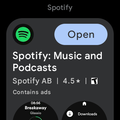
The new listings show the app icon and an “Install” or “Open” button to the right, with the app name, ratings, and screenshots below. It’s an information-dense view, though one that, at least personally, I’m not a big fan of on Wear OS’ typical round screens. On the Pixel Watch especially, it’s quite crowded, impacted by the watch’s small display. It’ll surely be better on something like a Galaxy Watch, but it’d still be better on a square display.
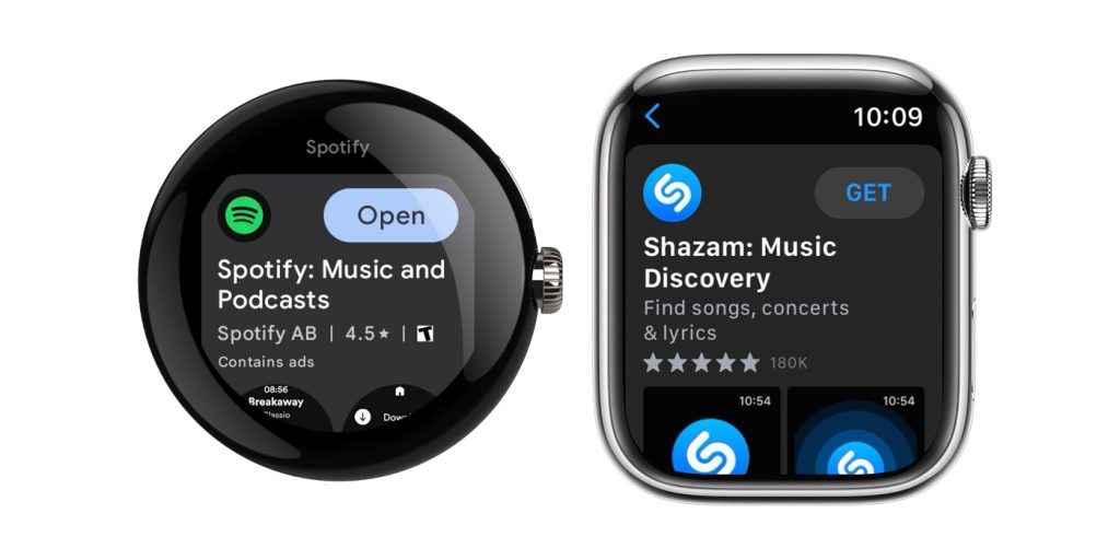
And, really, that’s only emphasized by the fact that this is literally a copy of the App Store’s search UI on the Apple Watch. The order of icons, buttons, and screenshots is pretty much identical as Apple’s own screenshot (below) shows.
App listings show in this new format for every result in a search, not just for the first result, as is often the case in the phone version of the Play Store. This change appears to be widely available as of now, and you can see it by searching any app in the Play Store on Wear OS.
Thanks, Leeroy!
More on Wear OS:
- Wear OS 4 seems to give Galaxy Watch support for Android’s upcoming ‘Watch Unlock’
- Google Messages for Wear OS will let you send voice memos
- Google Assistant support on Wear OS 2 ending August 31
FTC: We use income earning auto affiliate links. More.

Comments