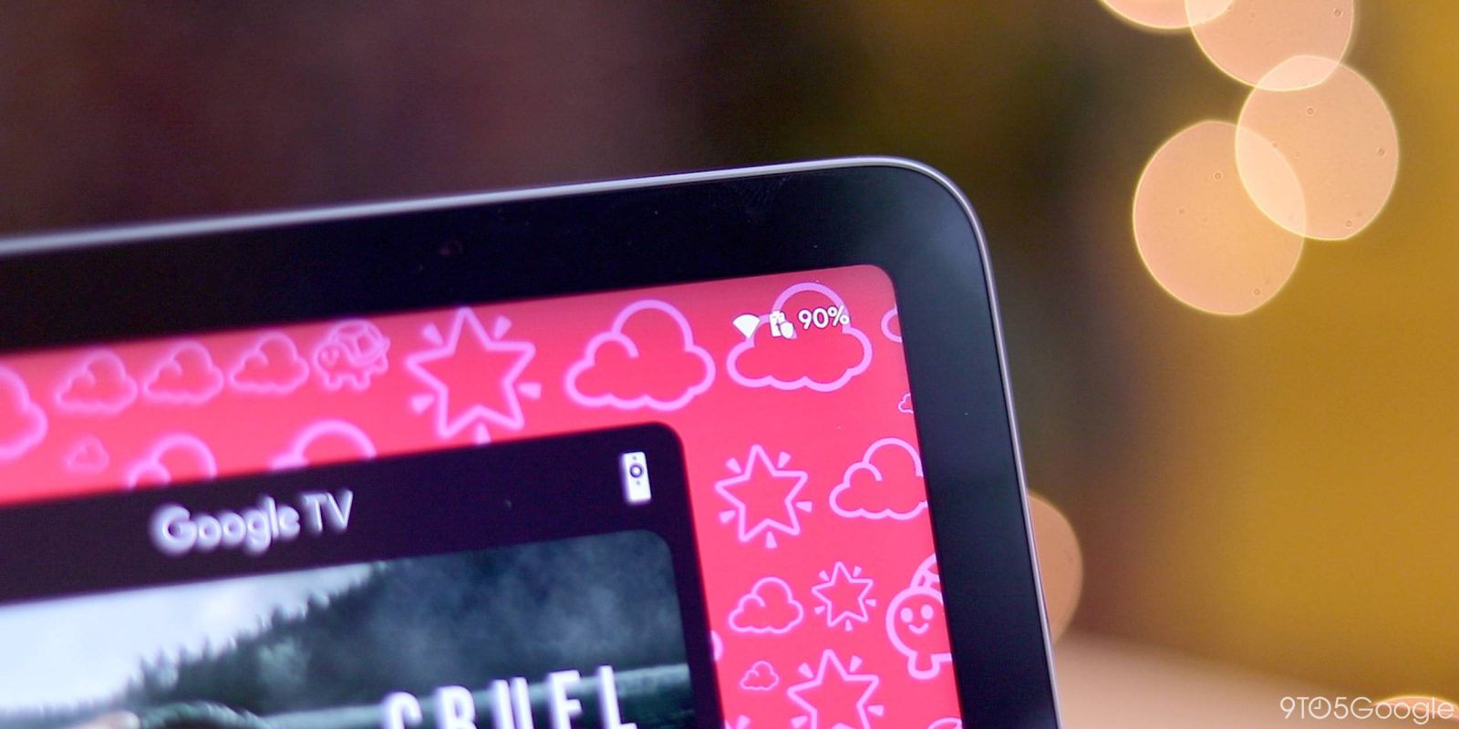
As part of optimizing phone-sized apps for tablets and foldables, Google replaces the bottom bar for a navigation rail. This puts controls where your hand rests when holding a large screen device, similar to how your thumb has easy access to the bottom edge of a phone, rather than needing a second hand to navigate.
In use, the nav rails work, especially since most Android tablets opt for wide screens, while the remaining empty space lets you rest your finger without interacting with content. However, how they’re adopted in each app varies much more than bottom bars (which already have some discrepancies).
Variety
Most first-party apps have been updated to use a navigation rail, with the majority showing the same tabs as the equivalent bottom bar.
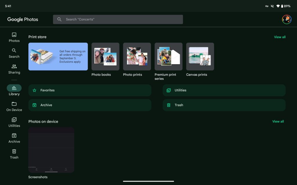
Google Photos is the exception by having On Device (folders), Utilities, Archive, and Trash — which all open fullscreen without a visible nav rail — join Photos, Search, Sharing, and Library. The Material 3 guidelines recommend 3-7 tabs, with Photos exceeding that by one. The rail is quite full as a result and looks quite busy.
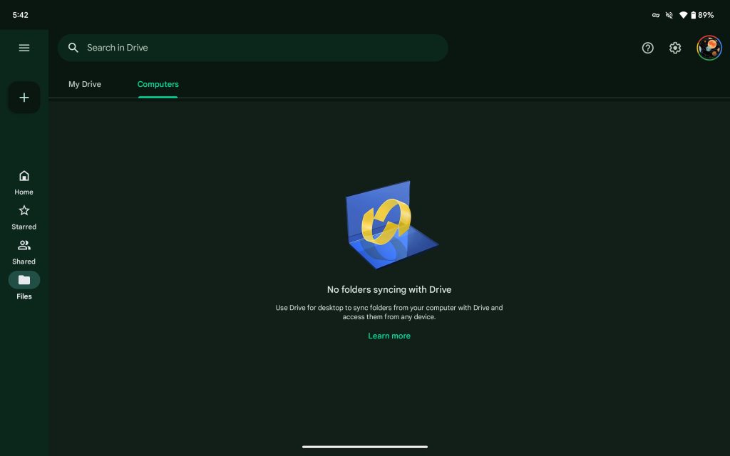
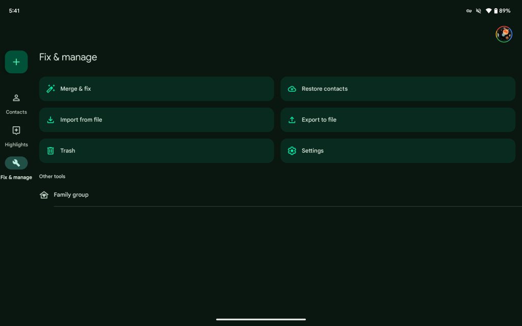
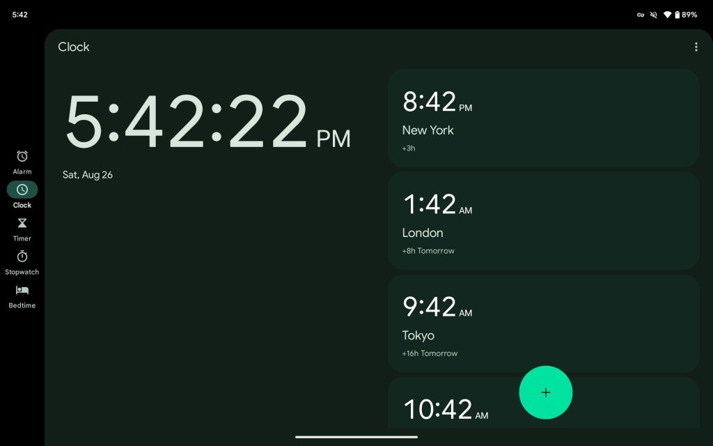
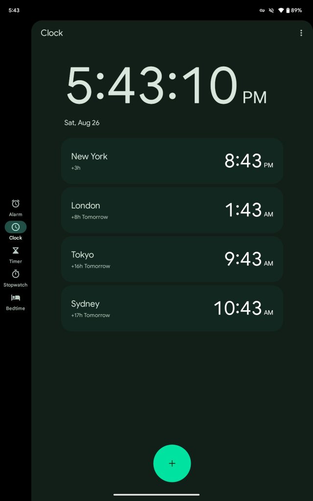
Nav rails can also be home to a hamburger menu and FAB at the top, instead of requiring a hand to travel to the bottom-right corner. Google Drive and Contacts are two such examples of this approach. The Clock app continues to use a large FAB (for new alarms, timers, etc.) that’s centered to the right-most column.
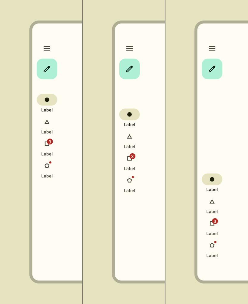
Google apps are divided between centering the tabs (most) or placing them at the top. Meanwhile, M3 guidance notes how “bottom alignment can make destinations easier for a user to reach with their thumbs.” In these cases, the “menu and FAB should always be aligned to the top of the navigation rail.”
Inconsistencies
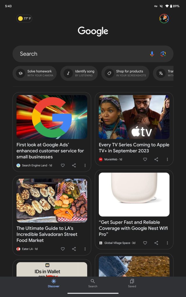
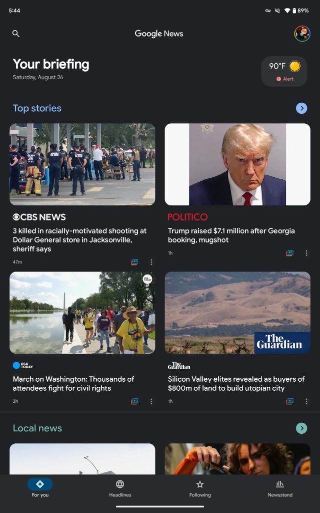
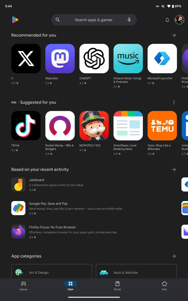
While the vast majority of Google tablet apps use a navigation rail in both landscape and portrait orientation, there are exceptions: Google app, News, Play Store, and Books.
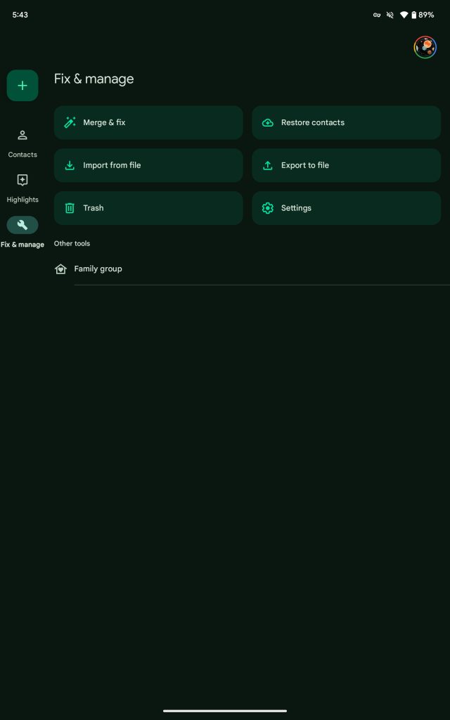
Nit: Fix & manage, which is already an unwieldy name for a tab, barely fits.
Using a rail in both orientations would be the consistent thing to do, but this approach does allow the phone layout to be reused. An argument about how this conserves development resources by reusing the phone layout can be made, while another is that nav rail takes more space than a bottom bar in these configurations and is actually better for the end user experience in content-heavy apps.
Holdouts
While the vast majority have seen updates, there are still some first-party applications that use a bottom bar. The biggest holdouts are the YouTube family of apps, including Music and TV. Sticking to a bottom bar maintains phone-tablet consistency and is presumably easier for development. However, it does make YouTube stick out, especially when it’s otherwise optimized with two column layouts.
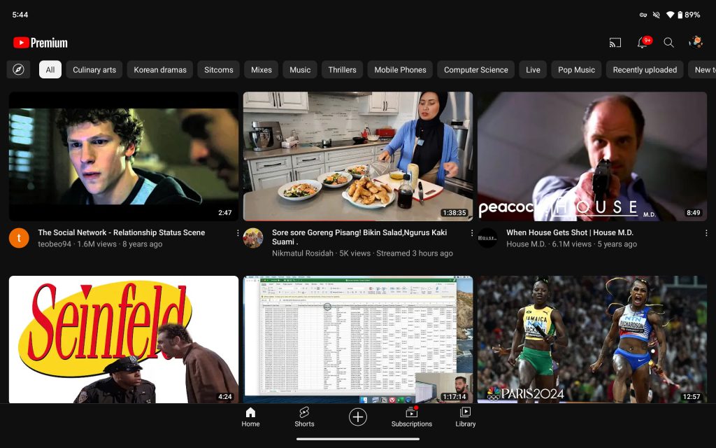
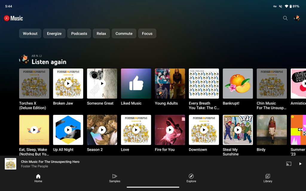
I prefer YTM’s spread-out bottom bar
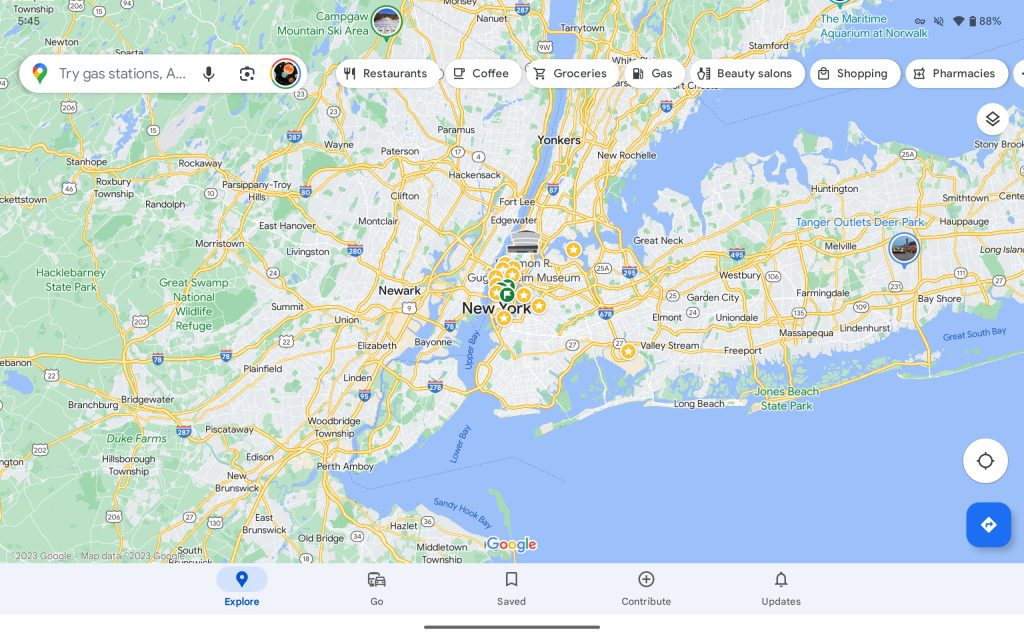
The other major one is Google Maps, which uses a navigation rail on the web as part of its excellent Recent sidebar that would be a great addition on Android.
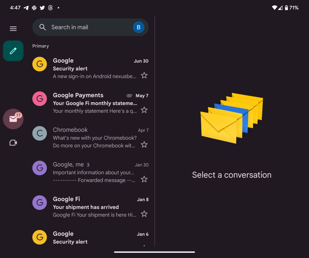
There’s also Google Voice and Gmail on tablets, even though the app on foldables uses a rail. (This is presumably an oversight.)
FTC: We use income earning auto affiliate links. More.

Comments