The current Google Wallet app is very simple with a lot of empty space that a compact-focused upcoming redesign looks to address.
The app still starts with “Wallet” and your profile avatar at the top. However, your payments credit and/or debit cards appear immediately after that as Google has removed the unnecessary circular NFC animation.
The carousel has been tweaked so that cards no longer appear side-by-side, but rather one behind another with the dots noting how many you have removed. In its place is an NFC symbol and bank name. This change allows you to peek at what other payment methods you have stored.
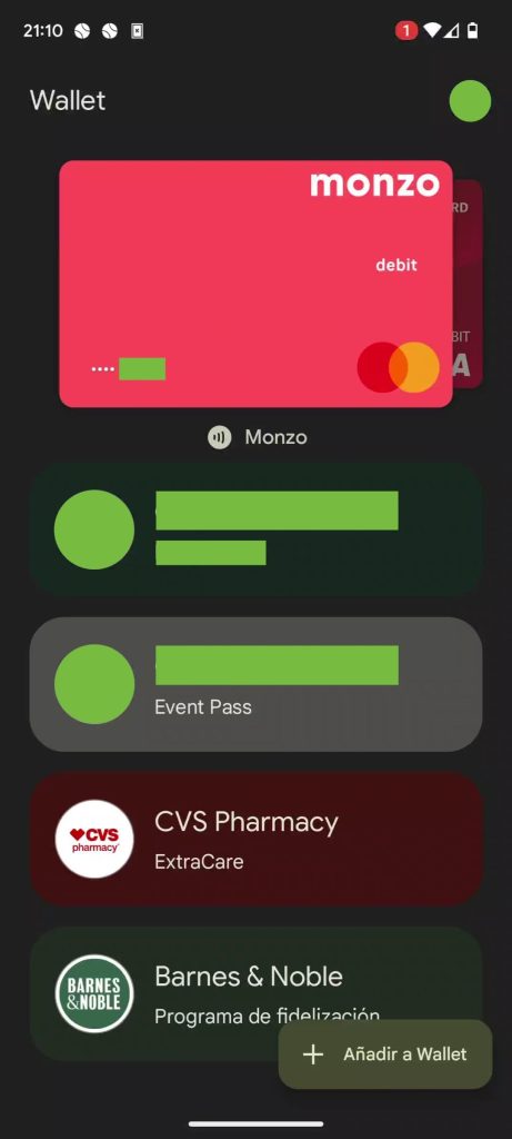
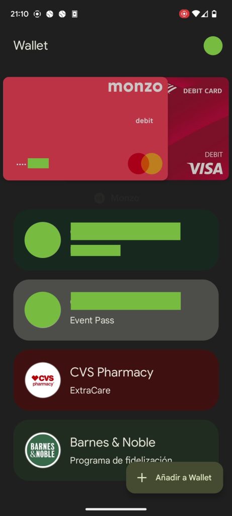
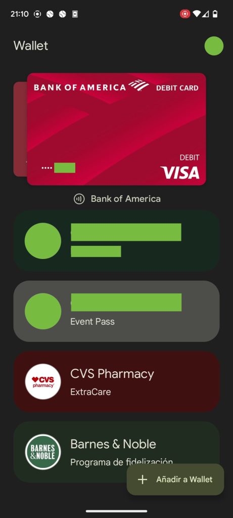
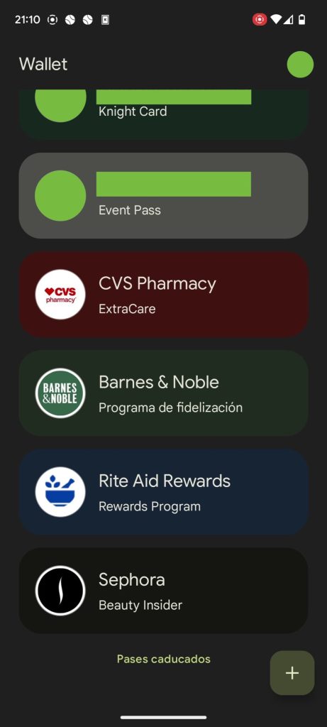
Compared to the previous design, the empty space below the carousel has also been removed. As such, you can see two more passes. In the current look, you have to scroll, thus hiding the carousel, to see anything beyond your first two passes. This redesign removes the docked view of your default card in the top-right corner.
As Google Wallet comes to support ID cards, digital car keys, and transit passes, being able to quickly access stored items, with less scrolling involved, will become increasingly important.
This compact Google Wallet redesign was spotted on version 2.193.x and is not yet widely rolled out.
More on Google Wallet:
- Google Wallet is now available in five more countries
- Google Wallet supports adding any barcode or QR code manually, new driver’s licenses
- June Google System Updates: Wallet UI for foldables, more [Updated]
- Wear OS getting new Keep and Spotify Tiles, Google Wallet transit cards
Thanks Alexia
FTC: We use income earning auto affiliate links. More.
Comments