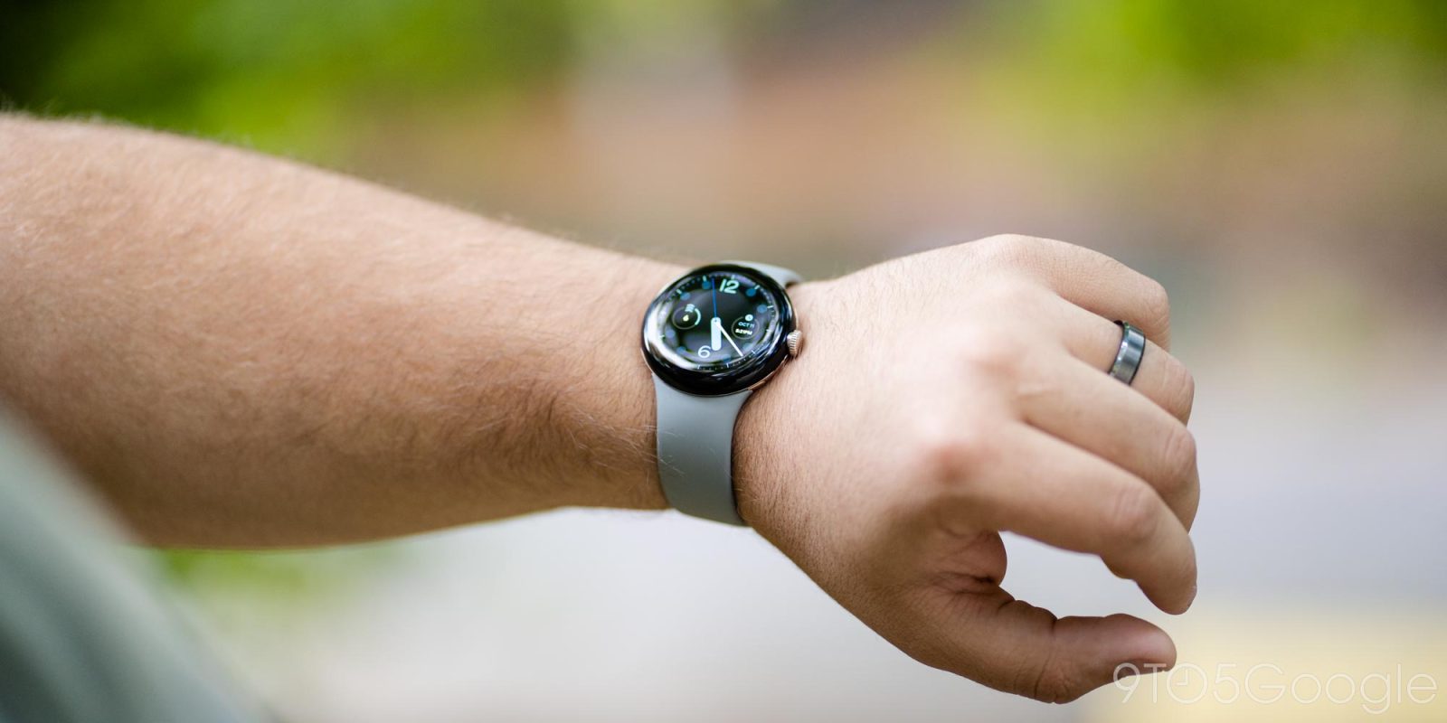
The Pixel Watch was most people’s first introduction — $1,300 wearable aside — to “stock” Wear OS 3, with the Fossil Gen 6 update rolling out shortly after. Now that more people have had time to use it, what do you think about Wear OS 3’s core UI and navigation?
One of the best parts of Wear OS 2 was its core navigation. Swiping down gave you access to Quick Settings, just like on Android phones and tablets, while going up would open notifications. An Assistant Snapshot-esque feed was found to the left of the clock face, while Google Fit was originally on the other side. In May of 2019, Wear OS made it so the left swipe accessed Tiles.
Tiling Tiles
With Wear OS 3, the primary UI change is that Tiles can be reached by going left or right, and you can eventually end up back on the clock face.
Samsung’s take on Wear OS 3 makes each swipe direction unique. A right-swipe opens notifications and an upward one opens the app launcher, while swiping left remains your access to Tiles. Meanwhile, the Apple Watch is quite different with left and right letting you quickly switch between watch faces.
Fundamentally, Tiles are a good idea to provide quick access to core app functionality without having to open the entire experience. They force developers to focus on only offering what’s important, like quick actions. That said, it somewhat masks how some Tiles are basically the entire watch app, as seen with Agenda which is a view-only app.
Ahead of and for the Pixel Watch, Google released a Keep tile that lets you quickly create a note and list, as well as open the app to view notes, while the one for Weather looks nice and is info-dense enough.
The first-party watch also uses Tiles to provide access to a lot of core Fitbit functionality like seeing last night’s slumber, your main fitness goal, and last activity, live heart rate, and starting an exercise or ECG reading. It’s a good idea with many leading to the Fitbit Today feed, which was a nice carryover from Fitbit OS smartwatches.
…versus watch faces
However, Tiles — by nature — are not as info-dense as Apple’s watch face approach that greatly benefits from rich complications that can be customized to show exactly what you want to see. Wear OS 3 on the Pixel Watch does not have very info-dense complications, with only a handful showing live data (versus just acting as glorified shortcuts, which can be very helpful).
If more developers build for Wear OS 3 that could change, but Tiles are fine for now. However, I’m not a fan of the infinite swipe for Tiles on the Pixel Watch, Fossil Gen 6, and Montblanc Summit 3. I think Samsung has the right idea by letting you open apps by swiping and tapping instead of having to press a hardware button first. It’s noticeably quicker and something for Google to consider once apps become more plentiful on Wear OS.
Feed-less, and why Google Now on Android Wear was great
Meanwhile, it’s a shame Google killed the Assistant feed. It was not that helpful on Wear OS and Snapshot is also dead on phones, but a persistent feed that’s essentially At a Glance from the Pixel Launcher would be a good way to differentiate the Pixel Watch going forward. It gives Google smarts a dedicated space to bubble up useful ambient information for your data and gives people something to check-in with throughout the day.
However, giving people another feed that’s secondary to notifications could be confusing. Ironically, Google solved this on its wearable platform’s first iteration. Android Wear combined notifications with contextual Google Now cards. Again, the direction of Assistant on phones suggests a feed is not coming back anytime soon, but it very much fits in line with Google’s long-term ambient and assistive goals.
Hardware buttons
Wear OS 3 introduces a side button that lets you access a Recents view, while double-tap brings you to the last-open app. Multitasking is necessary, even if slightly comical, on a watch, but the button – by default – is awkwardly placed on the Pixel Watch above the crown. (It would make more sense below, but the button for swapping bands is there.) At the very least, that double-tap should be user-customizable on single-button devices.
Share your thoughts in the comments below!
FTC: We use income earning auto affiliate links. More.


Comments