With the first Android 12 Developer Preview, a massive redesign of the Settings app was discovered, pointing to a revamp of Google’s Material Design. Let’s take an exploratory look at what some of Google’s other Android apps could look like with these next generation Material Design cues.
Based on purported Google design mockups that leaked ahead of Android 12 Developer Preview 1, the operating system update is poised to bring a major redesign to Pixel phones and beyond. In a separate leak, it’s been said that this redesign is referred to as “Material NEXT,” suggesting a third generation of Material Design guidelines.
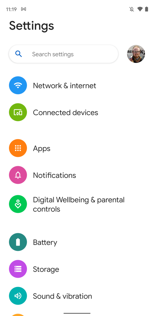
While there were less surface-level changes in Android 12 Developer Preview 1 than seen in the leaks, our team was able to enable what appears to be a Material NEXT redesign of the Settings app. The hallmarks include a more reachable design akin to Samsung’s One UI, a redesigned search bar, thicker items in lists, and a design that responds to the system-wide theme colors you’ve chosen.
With these serving as early guidelines, we decided to try our hand at imagining how Google’s apps might look with the next generation of Material Design. Throughout this post, you’ll see mockups which serve to visually demonstrate potential ways Google could redesign these apps. Keep in mind that Material NEXT is still early in development and each app is also subject to its own design choices.
Gmail
When Google first unveiled Material Theming as a step forward from Material Design, Gmail was among the first apps to get a “Google Material Theme” redesign. Starting our mockups on the simpler side, Gmail doesn’t need much in the way of a design shakeup.
Android 12 example 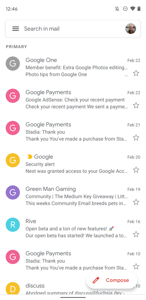
Gmail before 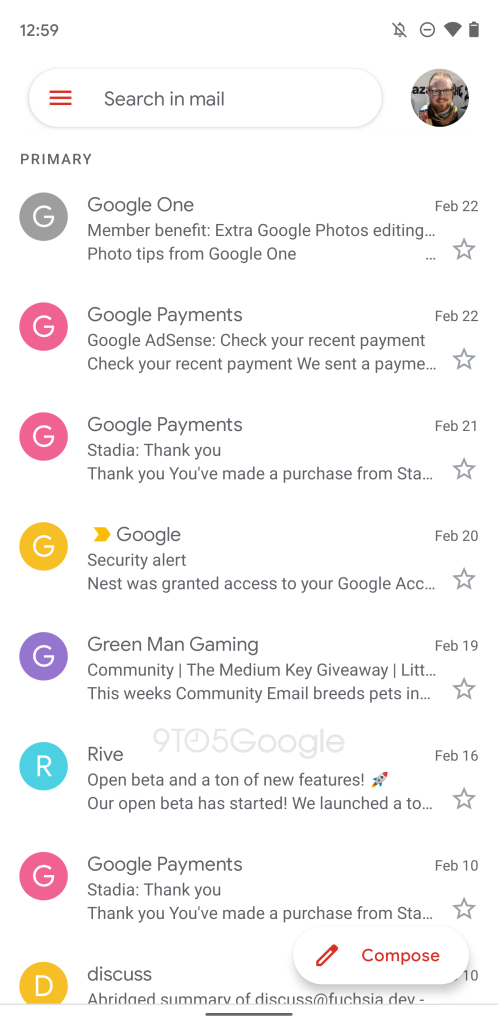
Gmail after (Mockup)
Here, we’ve simply swapped the “rounded rectangle” search bar for the more pill-shaped bar seen in the Settings app. The biggest change in the search bar is that the Google Account avatar is significantly larger and now floats outside of the search bar, making it easier to touch or swipe.
Play Store
The homepage of the Play Store made a similarly perfect candidate for the revamped search bar. In fact, the Play Store is better prepared for this Material NEXT redesign for the search bar than most other apps, as Google has previously experimented with ditching the drawer menu altogether. In that particular experimental redesign, the drawer’s options moved into the menu that opens when you tap your avatar.
Android 12 example 
Mockup 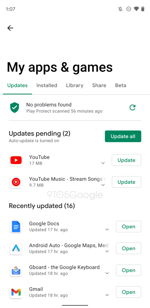
Mockup
Meanwhile, other sections of the Play Store are prime for another major piece of Material NEXT redesign. In the Settings app, each page is given a kind of banner that takes up roughly the top third of the screen, keeping the page’s contents within your thumb’s reach. The banner smoothly shrinks and grows based on your scrolling. In the second Play Store mockup above, we’ve applied this flexible banner design to the “My apps & games” page.
Contacts
Adding another layer to the mix, we believe that Material NEXT is closely related to the leaked and recently demonstrated theming system of Android 12. When developers in the Android community were able to enable the theming system, the colors were also used prominently in the Settings app, including as a primary background color.
Android 12 example 
Contacts before 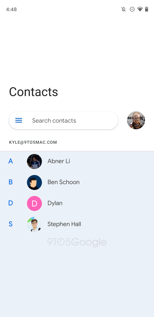
Contacts after (Mockup)
For this mockup, we’ve taken the Google Contacts app, swapped out the search bar, added an upper-third banner, and added the default bluish white color seen in the Settings app today.
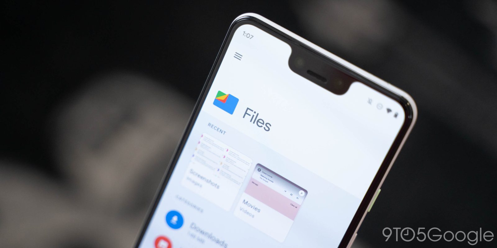
Files by Google
The last piece of Material NEXT we can point to today is that Google has revamped the Settings app homepage to make the items thicker. This particular design choice will need to be used selectively by app developers, as it significantly reduces the “content density” or how much useful information you can fit on screen. For instance, Google would do well to skip this particular tweak in Gmail.
Android 12 example 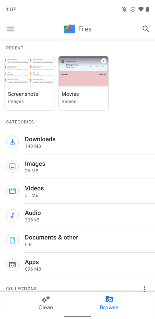
Files before 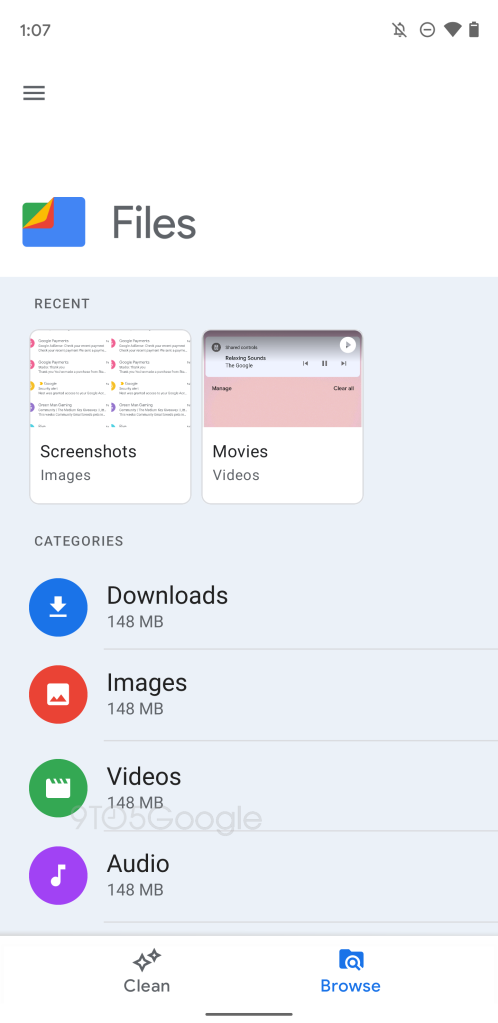
Files after (mockup)
Putting it all together, the Files by Google app could be given a pretty significant Material NEXT makeover. The mockup above uses an upper-third banner to keep everything in thumb’s reach, recolors the app’s background to the default blue, and uses thicker list items.
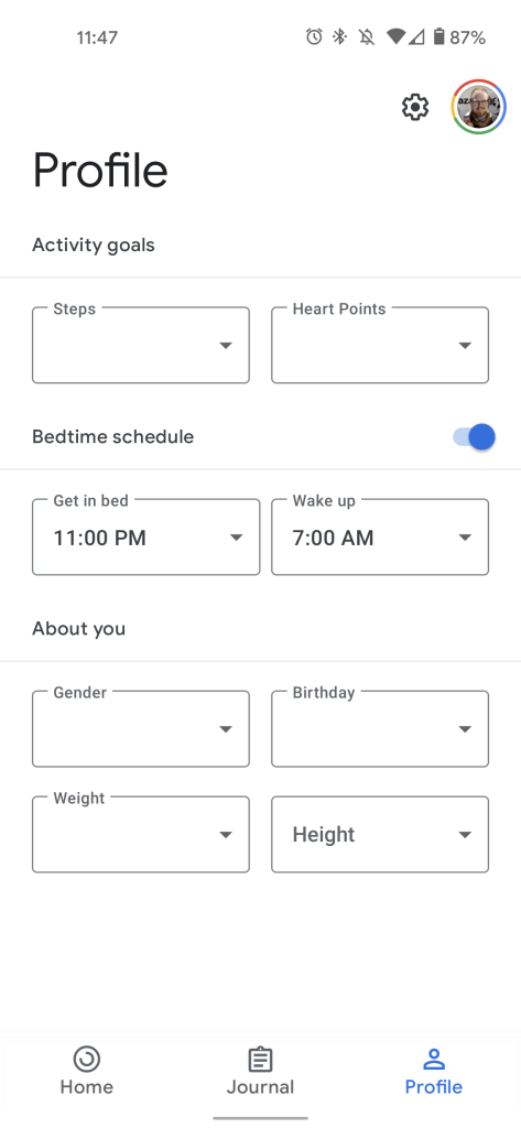
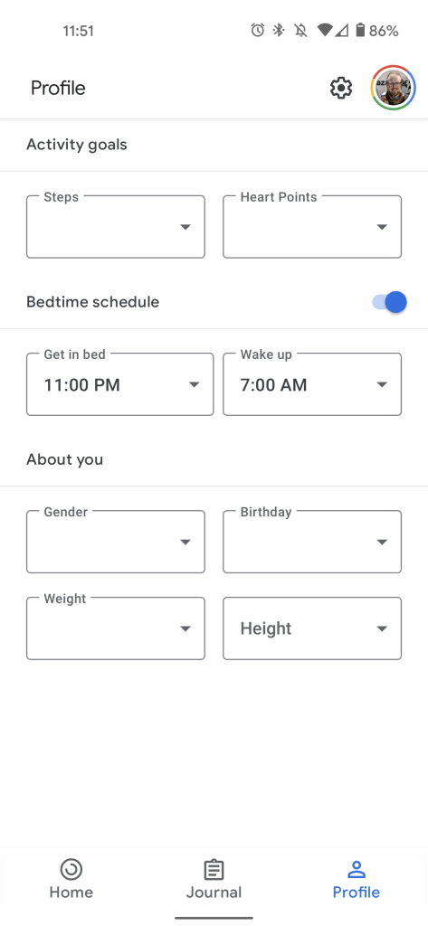
Bonus: Google Fit
Seeing these — in some cases major — redesign suggestions, it’s only natural to wonder how long it may take for Google’s apps to actually catch up to what’s happening in Android 12. In the process of putting this collection together, we realized that Google Fit is already using the flexible upper-third banner in some places. Take that for what you will.
FTC: We use income earning auto affiliate links. More.
Comments