
Notable Material Theme redesigns in recent weeks have included Gmail for Android and Google Drive. The next major one could be for the Play Store, with 9to5Google this evening successfully enabling a significant revamp for the app store with version 14.5.52.
About APK Insight: In this ‘APK Insight’ post, we’ve decompiled the latest version of an application that Google uploaded to the Play Store. When we decompile these files (called APKs, in the case of Android apps), we’re able to see various lines of code within that hint at possible future features. Keep in mind that Google may or may not ever ship these features, and our interpretation of what they are may be imperfect. We’ll try to enable those that are closer to being finished, however, to show you how they’ll look in the case that they do ship. With that in mind, read on.
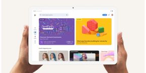
Like Drive, Google Play’s redesign is significant for adopting a bottom bar. The four tabs highlight Home, Games, Movies & TV, and Books, with each featuring a Material Theme icon that has a mostly hollow interior and bold outlines. When in view, each is themed in their respective green, red, or blue accent color.
There is no dedicated tab for accessing music in the bottom bar, but there is a new “Browse music” shortcut in the navigation drawer, which is mostly unchanged save for Material Theme icons.

At the top of the Play Store is a new search bar with more rounded corners and an elevated shadow effect. The hint now reads “Search apps & games,” “Search Movies & TV,” or “Search Books” instead of the Google Play wordmark. Lastly, there is a new Material Theme microphone icon at the right.
Thanks to the bottom bar, the Play Store no longer needs nested tabs. The first (and only carousel) at the top does not features icons for sections like For You, Top Charts, Categories, Editors’ Choice, etc.
Carousels for apps feature bolder section headers, while the “More” icon has been replaced by a right arrow to open. As you can see here, apps all feature rounded square icons per the latest Google Play guidelines.
The App Info page has been redesigned with the Google Sans font, which is especially notable for the app name. Applications that aren’t installed feature a full-width button to do so with more rounded corners.
Meanwhile, app categories and other labels — like “#1 Top Grossing” — have been moved below screenshots and the app description. When installing, the download indicator is no longer a straight line, but is now circular and around the app icon.
Elsewhere, the “My apps & games” screen features new tabs where sections like Updates and Installed are not upper cased. Items here no longer feature light gray line separators, while there is also a “Permissions” section.
This Google Material Theme for the Play Store is still in development, with some parts of the UI that we managed to activate unfinished.
Dylan contributed to this article
FTC: We use income earning auto affiliate links. More.
Comments