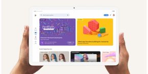
Google seems to be slowly rolling out, via a server-side update, a new layout for the Play Store app that allows you to scroll through app listings via a new card-style layout.
It’s not exactly clear how this new layout will work quite yet; so far, the below video is all we have to go off of, and none of our devices are showing the new layout. But it seems that the home page of the Play Store app will remain the same, according to one of the comments in a Google+ thread, and that this layout will show the app listings you already know in a new card style that lets you easily swipe between them.
Like I said, we aren’t seeing the update ourselves quite yet, but several Google+ users are reporting to have the new layout. One by the name of Rony Mishchuk provided us with the below video. We’ll update this post when we have more to show you.
Updating…
FTC: We use income earning auto affiliate links. More.


Comments