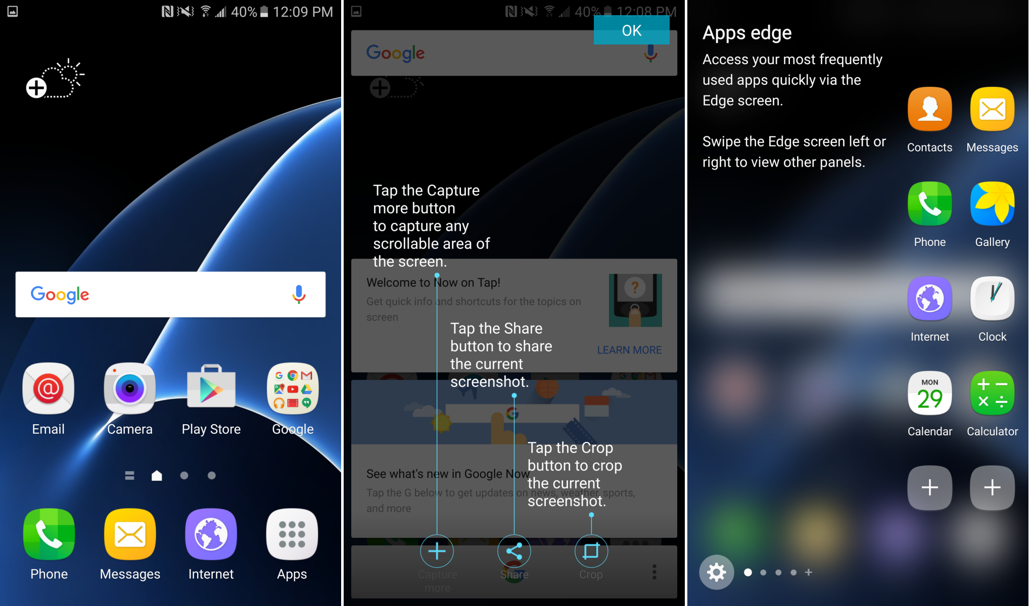
TouchWiz was once a complete mess, believe it or not, but the Android skin got much better with the release of the Galaxy S6 and Samsung’s move to using Android Lollipop. Now, most agree that the skin has gotten even better with the Galaxy S7. Thanks to some screenshots (via XDA) shared by one Daniel Marchena (who was lucky enough to already have his S7 delivered), we now have a detailed look at the modified version of the OS we saw running on the Galaxy S7 last week…
TouchWiz’ main criticisms in the past came from the fact that it was extremely bloated, cluttered, and just plain ugly. Those problems have effectively vanished in recent years, leaving Samsung’s version of Android notably above many of its competitors in this department. Of course that trend continued this year, with Samsung making better use of the edge screen on the S7 edge, moving to nicer colors in the quick settings menu, and of course the introduction of always-on display among other features.
Below you’ll find some screenshots of TouchWiz as it stands today. Of course Samsung still supports theming of its flavor of Android as well, meaning that those who are Material Design purists have the option to get pretty darn close to stock. In fact, it looks like some of the below images show the latest version of TouchWiz with the custom Material Design theme applied, giving you a look at just how close you could get to a pure Nexus experience with the new Galaxy S7 and S7 edge.


FTC: We use income earning auto affiliate links. More.


Comments